C1 Advertising
Do Now Friday 28th February 2025
 1. 2.
1. 2.2. 70%.
3. 40%
4. To make money.
What is advertising
LO: To explore the aims of print advertising.
1. The main aim of advertising is to persuade , inform or educate people, raise awareness and to create a unique selling point.
2. Commercial advertising aims to make money. It does this by promoting a product or service. However, non-commercial advertising aims to inform people and persuade people to donate their time or money into a charity


Do Now Wednesday 7th March 2025
1. To persuade, inform or educate people
2. Raise awareness, create unique selling point
3. Advertising to make money
4. Charities
5. Things expected to be seen in a certain type of media
Advertising and Marketing
Codes and Conventions of Print Advertising:
- name of brand/product
-logo
-slogan
-specific details of USP/product or service
Hard sell is explicitly telling the audience what the product or service is.
Soft sell is subtly implying the service or product without clearly stating.

The main aims of the advert is to explicitly tell the viewer that HEINZ is natural, persuading people to pick HEINZ over other brands.
This print contains a slogan and a picture of the product.
This is a hard sell.
Hyperbole is used along with wordplay

This print contains their logo.
This is a soft sell.
Imperative language is used

Intertextuality
This advert uses intertextuality because it references the classic nursery rhyme of Humpty Dumpty. They have used the intertextuality to promote the children's clothing because traditionally Humpty Dumpty falls off the wall and cracks, however now he is wearing the Levis jeans, he cracks the floor instead of him self, implying the jeans are really tough.
Historical Advertisement

They have used a bright red puff to portray their logo and bring attention to the company name, along with the slogan being much larger than the other text on the advert. Similarly the layout of the puff in the foreground further captivates the eye of the viewer. The image of the woman smiling emphasises the enjoyment of coke.
Do Now Wednesday 14th March 2025
1. When it doesn't explicitly say what they are advertising. when they promote a lifestyle or values
2. Brand, Product.
3. Imperative, Emotive
4. Hyperbole.
5. Repetition.
Logo and Slogan
The logo is portrayed in a large red circle that takes up a good proportion of the screen, immediately catching the eye of the viewer. The slogan is located in the bottom left of the image, which, for a z-shaped layout, is stereotypical, as it will be the last thing the viewer sees due to the natural movement of eyes down the page. This means the slogan will typically be the thing they most remember as it is freshly planted in the viewers heads.
Layout
They have strategically used a Z-shaped layout and put the more important things, like brand name and catchy slogan, at the bottom, so they are naturally the last things the viewer sees, therefore resonates with them the most and means that is what they are most likely to remember
Images
The main image in the advert is portraying a, what seems to be, a happy, pretty, female taking part in a healthy and fun activity, whilst associating with coca cola, this could present an idea to the viewers that persuades them to indulge in coke for a happier, more active lifestyle.
Language Code
Imperative language is used in the advertisement to persuade the viewers to buy and drink coke.
Narrative
The advert portrays a male and a female playing tennis, meaning coke could possibly be the reason for fuelling their happy and healthy lifestyle.
Colour palette
The advert contains quite monochrome colours, and a very big, bright red logo, drawing attention to the brand.
Historical Advert Set Text.
LO: To explore the context and content of the historical set text.


Do Now Friday 25th April 2025
1. How the media presents something to appear like something
2. 1950s
3. Not much other purpose to aid and care for men
4. aimed at the working class
5. Delicious
Male Gaze Theory
The male gaze is the way in which the media presented the world and women to appeal to men, depicting women as objects for male pleasure. This was coined by Laura Mulvey in 1975.

Green area- Depicts society a patriarchal, as the man is situated in the middle, it suggests the he is the centre of attention and the girls are just accessories.
Yellow area- The women dressed as the sweets suggest they are 'delicious' like the quality streets, and further accentuate the patriarchal system in society as it has connotations of male pleasure from the sexualisation of the women.
Blue area- The suit in which the man is wearing connotes power, wealth, and success, which is closely linked to the idea of quality street being advertised at the working class, almost suggesting they can be like him if they buy the product, allowing them to have power over women, just like the man in the image.
Pink area- The phallic symbol of the quality street in his lap further connote patriarchy as it suggests the sexual objectification of the women are purely for male pleasure.
Positive
Inquisitive, interested, curious, disabled, handicapped
Negative
Nosy, retarded, crippled
Do Now Friday 2nd May 2025
1. What is suggested
2. Power, Danger, Warning
3. Loyal
4. The theory that everything is created for male pleasure. Media presents the. -world through male perspective
5. A symbol that represents a group or company.
Persuasion in Adverts
a- adobe
b-barbie
c- coca cola
d- disney
e- internet explorer
f- facebook
g- google
h- honda
i-
j-
k- kellogs
l- lego
m- mcdonalds
n- nintendo
o- orea
p- pinterest
q-
r- reeses
s- skype
t- tumblr
u-
v- virgin media
w-wikipedia
x- xbox
y-yahoo
z- amazon
Rhetorical question- a question that does not require an answer
Repetition- repeating something to gain emphasis
Alliteration- multiple consecutive words beginning with the same letter
Emotive language- words used to evoke emotion
Opinion as fact- Coca cola is the best fizzy drink
Celebrity endorsement- getting a celebrity to promote something to attract a wider target demographic
Hyperbole- exaggerating something to add emphasis
Facts and statistics- people who eat spinach have an instant muscle growth of 98%
direct address- YOU need to buy this
Imperatives- an instruction
1. Imperative, emotive language.
2. Imperative, direct address.
3. Triplet.
4. Repetition, Hyperbole, Opinion as fact, alliteration.
5. Direct address.
This soup might have tomatoes in

The use of repetition emphasises the point of the advert, whilst also relative to the subject of the matter. Furthermore, the use of fact enlightens the audience on important information in which is spread to raise awareness and bring to light an important topic.
Do Now. Friday 9th May 2025
1. Rhetorical question, superlative, hyperbole
2. Imperative
3. Alliteration
4. Direct address
5. Emotive language
Women in Advertising
LO: To evaluate how women are represented in
a variety of adverts, so that we can apply this to the set text for the exam.

'Im slow but i'm lapping everyone on the couch'
This message shows to women that even if they are not immediately good at a new activity, they are still doing better than the people not trying, therefore conveying the message of you fail everything you don't attempt.

Women is this advert are represented as confident. This is portrayed through multiple aspects of the advert. For example, the good posture and stern, emotionless, facial structure along with direct address.
Furthermore the mantra 'take the crown' is an imperative, which directly links to my original statement of the portrayal of confidence.
The main differences between the Nike and Adidas posters, and the this girl can posters, is their reasons for the adverts. The this girl can advert is presented as an explicitly non-commercial poster, therefore meaning it is not in aid of making money, but to raise awareness and fight negative stereotypes of women in sports. However, the Nike and Adidas posters are commercial, ergo for monetary benefit as it promotes their clothing as well.
Do Now Friday 16th May 2025
1. This girl can
2. To break down the barrier that stops females from taking part in activities.
3. Fit, overly sexualised
4. Fear of judgement
5. 2016
Advertising Set Text 2
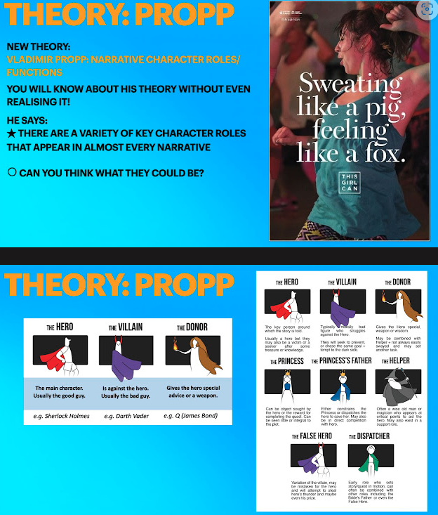
sweat- effort, activity, perseverance.
fox- agile, nimble, attractive.
pig- ugly, fat, slow, lazy.
Lexis
'sweating like a pig, feeling like a fox'
this links to the name of campaign as the connotations of 'sweat' suggest effort and activity, which is directly related to 'this girl can' through the way it implies females have the ability to put in the work if not for the judgement, which is combatted by the next statement, 'feeling like a fox' which shows they have nothing holding them back...
Typography
serif font- feminine target audience, traditional font made to look modern by adding lines separating parts of letters.
The serif font connotes femininity which links to the 'This Girl Can' campaign and its aim to break down the barrier stopping females from getting active in fear of judgement.
The logo and its block capitals connote a modern touch, possibly implying a new age for females where there is no judgement to fear.
Main image
The centred mid-shot is purposely used to give the viewer an idea about the type of activity the female is taking part in, whilst also being close enough to see her facial expressions. Her hair is scraped back into a very loose and messy ponytail to show the girl is doing a physical activity which portrays effort and authenticity. Furthermore the type of shot used can help us see the hair sticking to her face and the glare from the lighting reflecting off her face suggests she is sweating, this connotes perseverance, along with the clashing gym clothes she is wearing, this is challenging the stereotype of having to look attractive whilst working out, this gives a sense of reality within the image
In addition, the shot type, whilst also showing us the type of activity and facial expression, also gives us a peek into the background where we can see other women in the same position, this suggests community and that these women are not alone in their fitness journey. This could persuade women to indulge in sports as it shows the support from the other women surrounding her are blocking out the fear of judgement.

Similarities- serif font, shot type- mid shot.
Differences- quality street heavily focused on writing and commercial, this girl can is image oriented and non-profit
Do Now Friday 23rd May 2025
1. Cunning, attractive, sly.
2. The words that are written.
3. How the words look.
4. As an attempt to start a social media trend.
5. Mid-shot.
Advertising set text #2
Dominant ideology- The attitudes, beliefs, values and morals shared by the majority of the people in a given society.
1. Her facial expression creates a positive feeling about sports for the female audience as the visible sweat creates a sense of realness within the image, which could possibly inspire women as it suggests they are not being fed lies.
2. This advert seeks to encourage women to see themselves in the model chosen as she is portrayed with a positive facial expression, whilst displaying signs of struggle, she also appears to be smiling and portraying a sense of achievement in which could be inspiring towards women alike, furthermore the realness presented through her messy hair, and mismatched clothing is relatable for many women.
3. The word girl could alienate the older generation as words like girl have connotations of youth, which could have a negative impact on older women.
Theory: Propp
Comments
Post a Comment